Blog
How to Choose Ceramic Colors That Still Look Good After Glazing?
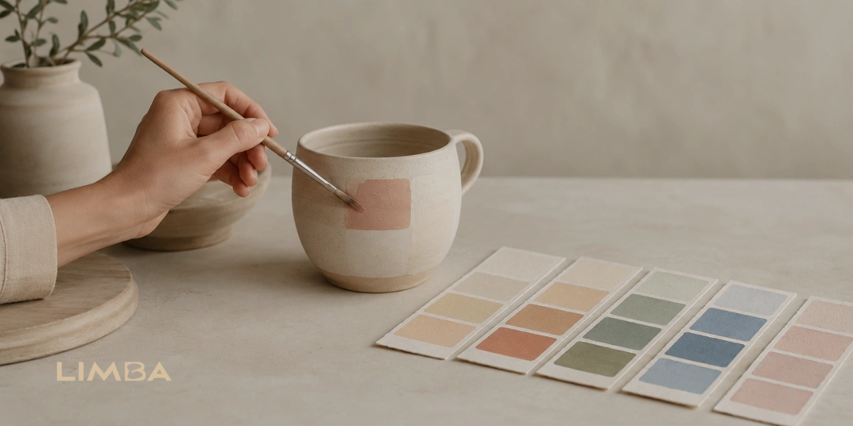
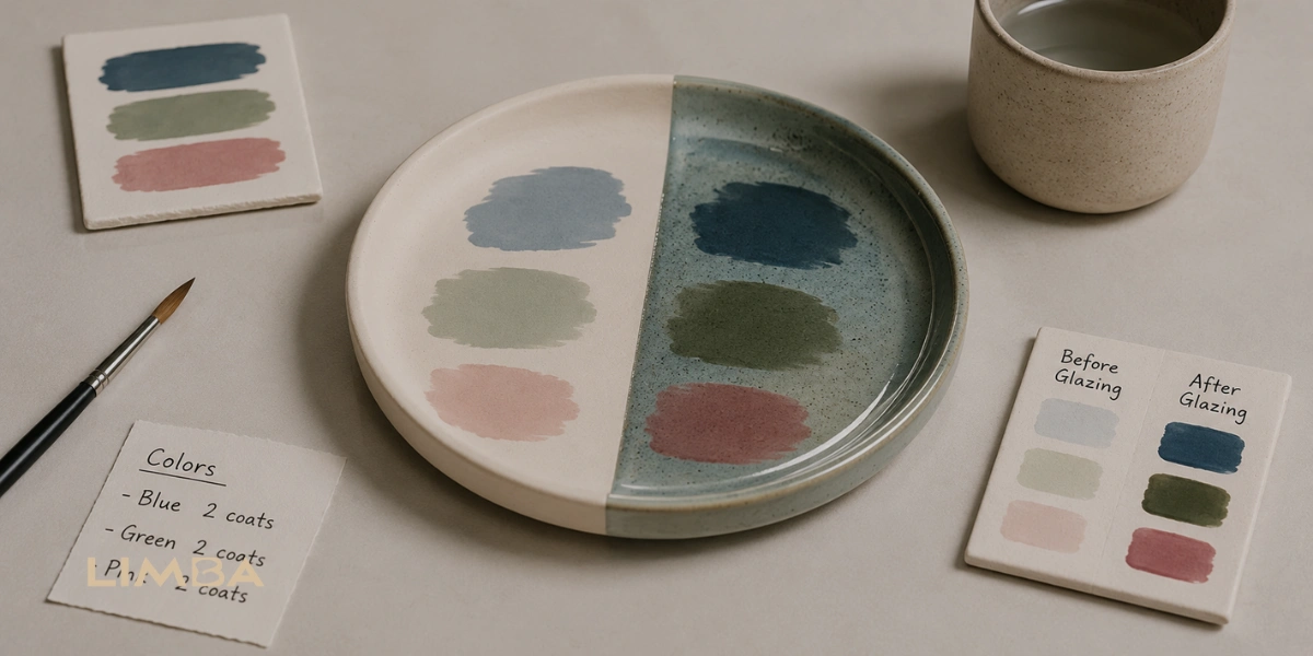
Choose Ceramic Colors by looking beyond how they appear wet or freshly painted. Check a fired sample whenever possible, consider how each color contrasts with the clay beneath it, and remember that clear glaze can make a shade appear deeper, brighter, or slightly different after firing.
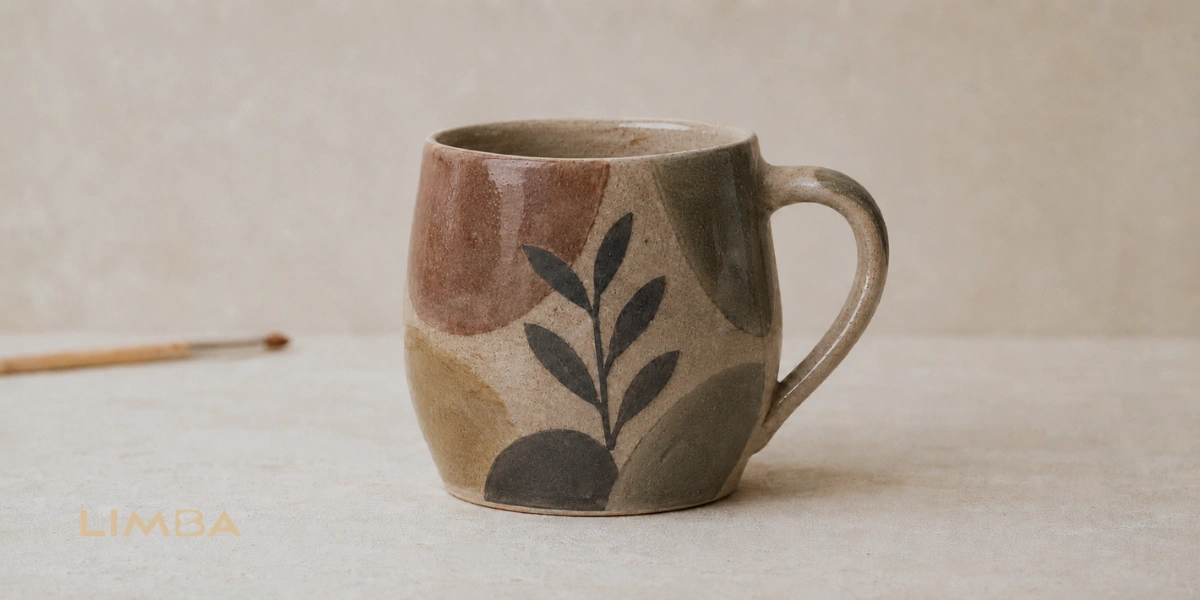
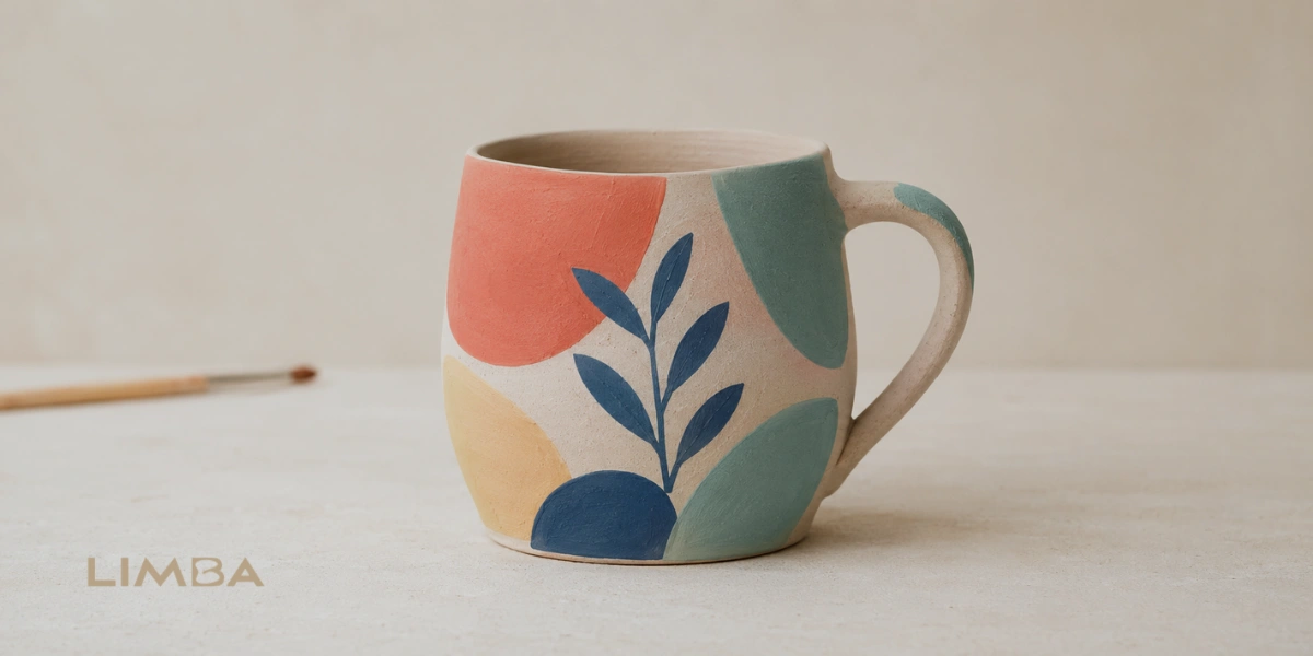
This change often surprises beginners. A color that looks pale and chalky while you are painting may become rich and glossy in the finished piece. Another shade may look strong before glazing but lose some of its visual impact once it is placed beside a darker color. This does not mean the color is unsuitable. It simply means ceramic color needs to be chosen with the final surface in mind.
Start by thinking about the piece as a whole. A mug used every morning may benefit from a calm, readable design, while a decorative plate can handle stronger contrast and more detailed areas. The natural background of the ceramic also matters because the same color can feel brighter on white bisque and softer on a warm cream clay body.
You do not need a large palette to create a satisfying result. In many cases, a few well-balanced colors are easier to control and allow the shape and painted details to remain visible. The goal is not to predict every small change inside the kiln. It is to make informed choices that give your design enough clarity, balance, and flexibility to still feel intentional after glazing and firing.
How Contrast Helps You Choose Ceramic Colors After Glazing?
Once you have considered the overall mood of the piece, look at whether the painted elements will remain easy to distinguish after glazing. Contrast is not limited to placing a very light color beside a very dark one. It also comes from the relationship between the painted design, the unpainted ceramic background, and the shape of the object. A delicate pattern may be visible on a flat white plate but become harder to read when wrapped around the curved side of a mug.
When you Choose Ceramic Colors, view the piece from the distance at which it will normally be seen. If two neighboring shades already appear very similar before firing, the clear glaze may make them feel even closer. Leaving small areas of the ceramic background visible can separate shapes and prevent the finished design from looking crowded. During a session such as bisque ceramic painting in Dubai, this can be checked while the design is still being planned.
Why Color Opacity Changes the Finished Design?
Opacity describes how much of the ceramic surface remains visible through the applied color. An opaque application creates a solid area, while a more transparent one allows the background and brush movement to influence the result.
This difference is important when painting lettering, outlines, or overlapping shapes. A pale transparent layer placed over a darker area may not remain clearly visible after firing. On the other hand, slight transparency can give broad brushwork a softer and more natural finish. Before adding extra paint, allow the first coat to settle and look for thin areas. This makes it easier to Choose Ceramic Colors and apply them with enough consistency without covering the character of the original brushwork.
How Layering and Firing Affect Ceramic Color Results?
Opacity becomes easier to manage when you understand what happens as one coat is placed over another. Layering is not simply a way to make a color darker. Each additional coat changes how much of the ceramic background remains visible and may also affect the way neighboring colors meet after glazing. If a second coat is added before the first has settled, the brush can lift or drag the layer underneath, leaving an uneven area that becomes more noticeable on the glossy finished surface.
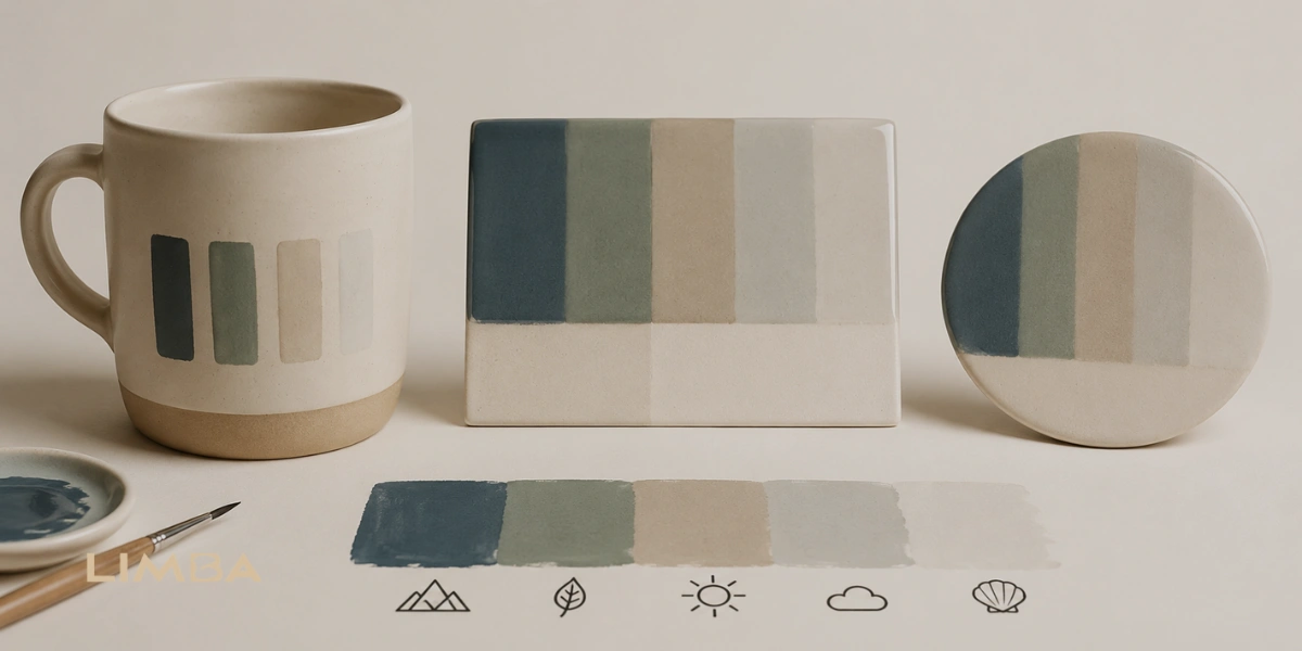
To choose ceramic colors with greater confidence, use a fired sample made with the same clay body, color product, clear glaze, and firing schedule as the final piece. A sample photographed online may not provide the same result because screen settings, lighting, clay color, application thickness, and kiln conditions can all affect its appearance. Experienced ceramic studios rely on fired test tiles for this reason. Practical glaze testing guidance also recommends testing colors on the clay bodies used in regular work rather than treating one sample as universal.
Firing is the stage where the painted surface and glaze mature under controlled heat. The color seen before firing is therefore an unfinished state, not a reliable preview of the final shade. This is why a trustworthy studio should never promise that every color will remain exactly identical. Instead, it should explain the likely change and show a relevant fired sample when available. When you choose ceramic colors based on the actual studio process, rather than a wet swatch alone, the final result becomes easier to anticipate without pretending that kiln-fired ceramics are perfectly predictable.
Five Checks Before Glazing
A beautiful wet color can look different after firing. Check these five details before finishing your ceramic piece.
Fired Sample
Use a fired test tile instead of judging the wet paint.
Background
Check how the shade looks against the actual bisque surface.
Contrast
Keep nearby colors different enough to remain clearly visible.
Opacity
Apply even coats and follow the recommended coverage.
Firing
Expect some natural change in color depth, gloss, and tone.
Preventing Color Surprises After Glazing
A color surprise happens when the finished ceramic piece looks noticeably different from the design you imagined while painting it. The blue may become deeper than expected, a soft shade may appear too close to the background, or two separate colors may become difficult to distinguish after the clear glaze adds depth and shine. Small changes are a natural part of ceramics, but a disappointing result is often preventable.
Before you Choose Ceramic Colors, place the available fired samples beside the actual bisque piece rather than viewing them separately. The same shade can appear stronger against a white background and softer against warm or cream-colored ceramic. Look at the samples under neutral light when possible, since warm indoor lighting can make creams, pinks, and yellows appear richer than they are. This is also a useful detail to look for when choosing a pottery workshop Dubai residents can attend, since access to fired samples makes color decisions easier.
It also helps to record the color names and the number of coats used while painting. If one section needs another coat later, you will not have to rely on memory. Follow the studio’s application guidance because different ceramic colors do not always reach full opacity with the same amount of paint. On textured pieces, remember that glaze may settle slightly differently around grooves and raised details, making some areas appear deeper after firing.
If you are uncertain about a combination, use it first on a small test tile or an inconspicuous part of the design. This will not remove every natural variation, but it reduces guesswork. The most practical way to choose ceramic colors is to plan for a small degree of change while protecting the contrast and clarity that matter most to the finished piece.
Choosing Ceramic Colors with Confidence
To Choose Ceramic Colors that still look good after glazing, begin with the finished result rather than the wet paint. Use a fired sample from the same studio whenever possible, compare it directly with the bisque background, and check that neighboring colors have enough contrast to remain distinct. A wet or unfired shade may look pale and chalky, then become deeper and glossier once it has been glazed and fired.
Opacity and layering also influence the final surface. Apply coats consistently, allow each layer to settle before continuing, and follow the instructions provided for the specific ceramic color. Adding more paint without checking the required coverage can make one area heavier than another, while a layer that is too thin may allow more of the ceramic background to show through.
The most reliable way to prevent a color surprise is to combine careful planning with realistic expectations. Record the colors and coat numbers you use, refer to fired test tiles, and test an unfamiliar combination before applying it across the whole piece. Firing can introduce slight natural variations, so an exact match cannot always be promised. However, when contrast, opacity, layering, background, and firing conditions are considered together, the finished piece is far more likely to preserve the clarity, balance, and character of the original design.
Frequently Asked Questions
Why do ceramic colors change after glazing and firing?
Ceramic colors often look pale, matte, or chalky before firing because they have not yet matured under heat. During firing, the colorants react to the kiln temperature and the clear glaze forms a glass-like surface. This can make colors appear deeper, brighter, glossier, or slightly different from their unfired appearance.
Which ceramic colors usually change the least after firing?
No ceramic color is completely predictable in every kiln. Commercial underglazes tested for the studio’s clay body and firing temperature usually provide the most consistent results. Cobalt-based blues and many black underglazes are often relatively stable, but the best guide is still a fired sample prepared by the same studio.
Does clear glaze make ceramic colors darker?
Clear glaze can make some colors appear deeper, richer, and more saturated because it adds gloss and changes how light reflects from the surface. It does not always make every color darker. The result also depends on the color’s opacity, the ceramic background, the thickness of the application, and the firing conditions.
How many coats of ceramic color should I apply?
The correct number of coats depends on the specific product and the amount of opacity required. Several even coats are commonly used, with each coat allowed to settle before the next is applied. Always follow the studio or manufacturer’s instructions because applying too little can create thin areas, while excessive paint may produce an uneven finish.
How can I avoid an unexpected color result?
Compare colors with fired test tiles, view them beside the actual bisque background, and keep enough contrast between neighboring shades. Record the colors and coat numbers used, and test unfamiliar combinations before applying them across the entire piece. These steps reduce guesswork, although slight variations after firing remain a natural part of ceramics.
Why do ceramic colors change after glazing and firing?
Ceramic colors often look pale, matte, or chalky before firing because they have not yet matured under heat. During firing, the colorants react to the kiln temperature and the clear glaze forms a glass-like surface. This can make colors appear deeper, brighter, glossier, or slightly different from their unfired appearance.
Which ceramic colors usually change the least after firing?
No ceramic color is completely predictable in every kiln. Commercial underglazes tested for the studio’s clay body and firing temperature usually provide the most consistent results. Cobalt-based blues and many black underglazes are often relatively stable, but the best guide is still a fired sample prepared by the same studio.
Does clear glaze make ceramic colors darker?
Clear glaze can make some colors appear deeper, richer, and more saturated because it adds gloss and changes how light reflects from the surface. It does not always make every color darker. The result also depends on the color’s opacity, the ceramic background, the thickness of the application, and the firing conditions.
How many coats of ceramic color should I apply?
The correct number of coats depends on the specific product and the amount of opacity required. Several even coats are commonly used, with each coat allowed to settle before the next is applied. Always follow the studio or manufacturer’s instructions because applying too little can create thin areas, while excessive paint may produce an uneven finish.
How can I avoid an unexpected color result?
Compare colors with fired test tiles, view them beside the actual bisque background, and keep enough contrast between neighboring shades. Record the colors and coat numbers used, and test unfamiliar combinations before applying them across the entire piece. These steps reduce guesswork, although slight variations after firing remain a natural part of ceramics.
ALSO READ:Is a 1.5 Hour Pottery Session Enough for Beginners?

Founder of Limba Ceramic, a brand dedicated to high-quality ceramic solutions that blend modern design, durability, and professional standards.